
This morning a post from Lucy Bernholz came across my inbox. I like following what she has to say on philanthropy because she loves data and metrics. And I don’t. She’s got a great way of making it more interesting than usual.
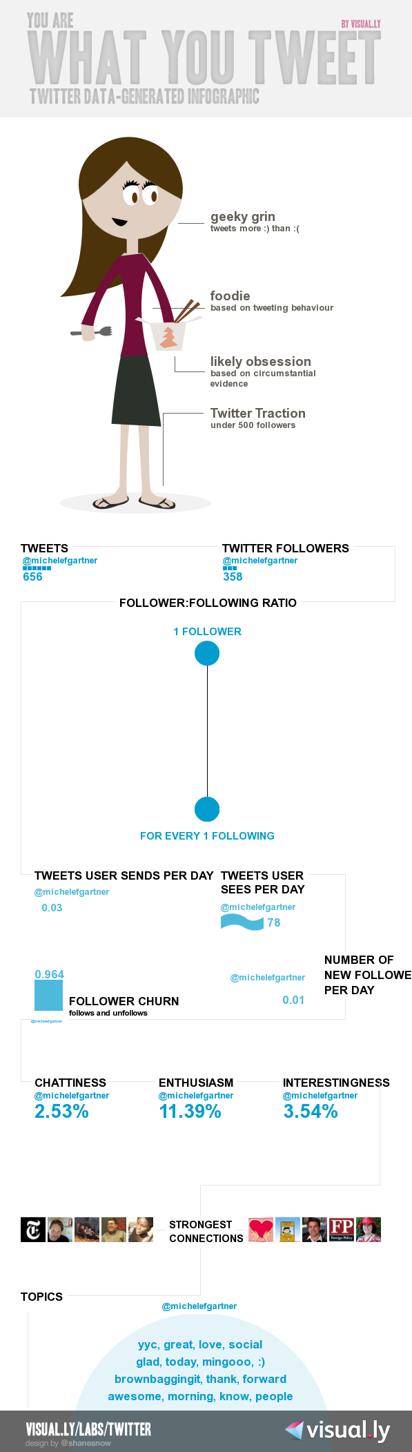
While I may not love data, I do love visuals. So I love, love infographics. Reading Lucy’s post today she introduced me to Visual.ly and the infographic I could make on my Twitter-self. I was so excited to pick out my hair and eye color that I nearly missed the fact that I’m only 3% interesting. Humph.
That’s okay though. Just like the psychologist told me when I applied for my last job – you don’t know anything about sales; you get by on charm. As seen in my slightly higher (11%) enthusiasm score.

(Originally posted at Ordering Cupcakes on July 15, 2011.)